In the vibrant world of design, color is more than just an aesthetic choice; it's a powerful communication tool. A well-chosen color palette can evoke emotions, establish brand identity, and guide user experience. But for many, the process of generating harmonious and effective color schemes can feel daunting. This guide will demystify color palette creation, offering practical strategies and insights to help you craft visually stunning and functional designs.
Understanding Color Theory Basics
Understanding the fundamentals of color theory is the cornerstone of successful palette generation. At its heart lies the color wheel, a visual representation of colors arranged according to their chromatic relationships. This wheel helps us grasp primary (red, yellow, blue), secondary (orange, green, violet), and tertiary colors, which are combinations of primary and secondary hues.
Beyond individual colors, harmonies describe how colors work together. Monochromatic schemes use variations of a single color, offering subtlety and elegance. Analogous palettes feature colors adjacent on the wheel, creating a serene and cohesive feel. Complementary colors, opposite each other, provide high contrast and vibrancy, while triadic and tetradic schemes involve three or four evenly spaced colors, offering rich and complex combinations. Grasping these relationships is crucial for building impactful designs.
Methods for Generating Palettes
With color theory as your foundation, you can explore various methods to generate captivating palettes. One effective approach involves drawing inspiration from the world around you. Nature, art, photography, and even everyday objects can be rich sources of color combinations, offering organic and often unexpected schemes. Analyzing these real-world examples helps train your eye to recognize compelling color relationships.
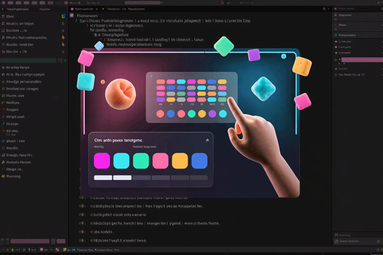
For those seeking a more structured approach, leveraging digital tools is indispensable. Many free developer tools are available that simplify the process of exploring and creating color palettes. These tools often allow you to experiment with different color harmonies, adjust saturation and brightness, and even check for accessibility compliance. They act as a digital canvas, empowering you to iterate quickly and visualize potential schemes.
Another powerful technique is extracting colors from images. If you have a photograph or artwork that resonates with your desired mood or theme, image color extractors can automatically pull out dominant hues, providing a ready-made palette. This method ensures your design's colors are deeply connected to a specific visual reference, fostering consistency and thematic cohesion. When sharing these visual guides or design specifications with clients, you might even consider converting your design documents using a Word to PDF tool to ensure universal compatibility and professional presentation.
Applying Your Color Palette
Once you've generated a compelling color palette, the next step is to strategically apply it to your design. Typically, a palette consists of primary, secondary, and accent colors. The primary color dominates the design, establishing its core identity. Secondary colors support the primary, adding depth and variation, while accent colors are used sparingly to highlight key elements and draw attention. This hierarchical approach ensures visual balance and clarity.
Consider the psychological impact of colors on your target audience. Warm colors like reds and yellows can evoke energy and passion, while cool colors such as blues and greens often convey calm and professionalism. The context of your design—whether it's a website, an application, or a brand logo—will heavily influence your color choices. Always strive for a palette that not only looks good but also effectively communicates your message and resonates with your users. Exploring an online dev tools collection can provide additional resources and inspiration for integrating these principles into your projects.
Tips for Success
To truly master color palette generation, embrace iterative design. Don't be afraid to experiment, test different combinations, and gather feedback. What looks good in isolation might not translate well in a full design context, so always test your palette on actual mockups. Accessibility is also paramount; ensure sufficient contrast between text and background colors to accommodate users with visual impairments. Many free developer tools include features to check contrast ratios, making this crucial step easier.
Finally, remember that consistency is key, especially in branding. Once you've established a palette, stick to it across all your design assets. This reinforces brand recognition and creates a cohesive user experience. A well-defined color system becomes a valuable asset, guiding future design decisions and maintaining a professional appearance.
FAQ
Q: How many colors should be in a typical palette?
A: While there's no strict rule, a common and effective approach involves 3-5 main colors: a primary, 1-2 secondary colors, and an accent color. You can also include lighter and darker shades of these main colors to provide more versatility without introducing new hues.
Q: What is the most important factor when choosing colors for a website?
A: The most important factor is often the target audience and the brand's message or purpose. Colors should align with the emotions and associations you want to evoke. Accessibility (contrast ratios) and readability are also critical for a positive user experience.
Q: Can I use a pre-made color palette?
A: Absolutely! Pre-made color palettes from design resources or popular frameworks can be an excellent starting point, especially for beginners or when you need quick inspiration. However, always customize them to fit your specific project's needs and ensure they align with your brand's unique identity and accessibility requirements.
Mastering color palette generation is an ongoing journey of learning and experimentation. By understanding color theory, utilizing effective tools, and applying strategic thinking, you can create designs that are not only aesthetically pleasing but also highly functional and impactful. Dive in, experiment with colors, and elevate your design projects today!