Adding depth and visual appeal to your web elements is crucial for modern web design. CSS box shadows are a powerful tool in your styling arsenal, allowing you to create subtle lifts, dramatic pop-out effects, and sophisticated visual hierarchies. However, crafting the perfect box shadow manually can often feel like a game of trial and error, requiring constant adjustments to multiple properties.
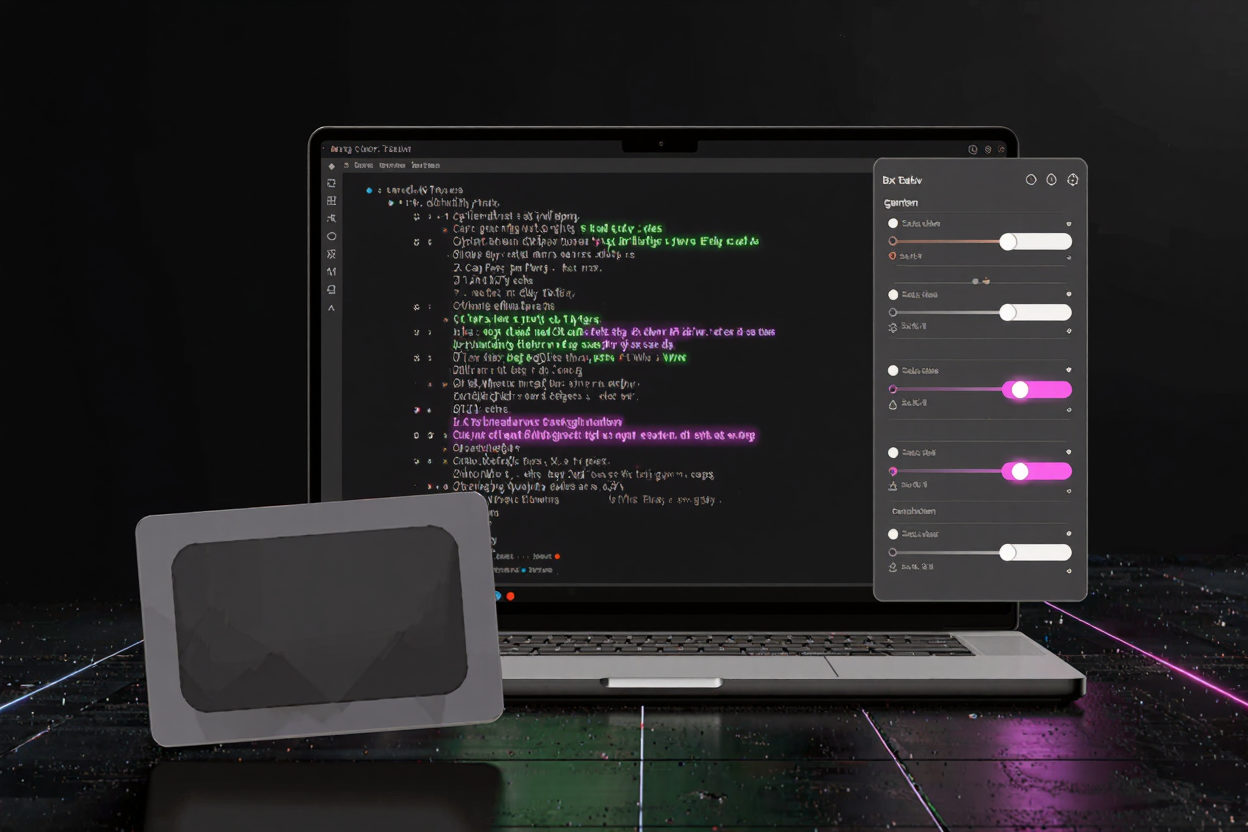
This is where box shadow generators become indispensable. These online tools simplify the process, providing a visual interface to experiment with different shadow properties in real time. They generate the precise CSS code you need, saving you time and ensuring accuracy. Let's explore how to leverage these generators to elevate your web designs.
What is a CSS Box Shadow?
At its core, a CSS box shadow is a visual effect that casts a shadow around an element's frame. It's defined using the box-shadow property in CSS, which takes several parameters to control its appearance. These parameters include horizontal and vertical offsets, blur radius, spread radius, and color. Optionally, you can also specify the inset keyword to create an inner shadow, making an element appear recessed.
Understanding these individual properties is key to mastering box shadows. While you can write the code by hand, the visual nature of shadows makes them ideal for generator-based creation, allowing for immediate feedback on every tweak.
Why Use a Box Shadow Generator?
The primary benefit of a box shadow generator lies in its ability to provide instant visual feedback. Instead of manually typing values into your CSS, saving the file, and refreshing your browser, a generator allows you to manipulate sliders and color pickers to see changes instantly. This iterative process is far more efficient for design. It encourages experimentation, enabling you to discover unique shadow styles you might not have considered otherwise.
Furthermore, these generators eliminate syntax errors and ensure you're using the correct CSS properties. For developers seeking to streamline their workflow and access a wide array of helpful utilities, many free developer tools are available online, and box shadow generators are a prime example of such efficiency-boosting resources.
Key Parameters of Box Shadows
To effectively use a box shadow generator, it's helpful to understand the role of each parameter:
- Horizontal Offset (
h-shadow): Controls how far the shadow extends horizontally. A positive value moves it right, a negative value moves it left. - Vertical Offset (
v-shadow): Controls how far the shadow extends vertically. A positive value moves it down, a negative value moves it up. - Blur Radius (
blur): Determines the blurriness of the shadow. A higher value creates a more diffused, softer shadow, while a value of 0 results in a sharp shadow. - Spread Radius (
spread): Expands or shrinks the shadow. A positive value makes the shadow larger, while a negative value makes it smaller than the element itself. - Color (
color): Sets the color of the shadow. Using RGBA values is highly recommended as it allows you to control the shadow's opacity, making it appear more natural and subtle. - Inset (
inset): An optional keyword that changes the shadow from an outer shadow (the default) to an inner shadow, making the element appear pushed in.
Many generators also allow for creating multiple shadows on a single element, stacking them to achieve complex and layered effects. This capability significantly expands the creative possibilities.
How to Use a Box Shadow Generator
Using a box shadow generator is straightforward and follows a simple workflow:
- Navigate to a Generator: Find a reliable box shadow generator online. Many are part of larger online dev tools collection platforms.
- Adjust Parameters: Use the sliders, input fields, and color pickers provided by the generator to adjust the horizontal and vertical offsets, blur and spread radii, and the shadow's color and opacity.
- Observe Real-Time Preview: As you make adjustments, the generator will display a live preview of the box shadow applied to a sample element. This immediate visual feedback is crucial for fine-tuning your design.
- Add Multiple Shadows (Optional): If the generator supports it, experiment with adding additional layers of shadows. This can create more realistic depth or unique stylistic effects.
- Copy the CSS Code: Once you are satisfied with your shadow, the generator will provide the complete CSS code. Simply click a button to copy it to your clipboard.
- Apply to Your Stylesheet: Paste the copied CSS code into your project's stylesheet (e.g.,
styles.css) for the desired element.
This process transforms what could be a tedious task into a quick and enjoyable design exploration.
Advanced Techniques with Box Shadows
Beyond basic depth, box shadows can be used for more sophisticated effects:
- Subtle Depth: Use a small vertical offset, a moderate blur, and a low opacity black or dark gray color for a gentle lift that enhances readability without being distracting.
- Pop-Out Effects: Combine larger offsets and blur values with a slightly darker color to make elements truly stand out from the background.
- Interactive Hover Effects: Apply a different box shadow on
:hoverto create engaging visual feedback when users interact with buttons or cards. - Layering Shadows: Use multiple shadows to simulate complex lighting, creating a softer, more realistic fall-off or distinct layers of depth.
- Designing UI Elements: Shadows are excellent for defining interactive elements like cards, modals, and navigation items, giving them a tangible presence on the page.
Best Practices for Box Shadows
While box shadows are versatile, using them effectively requires adherence to a few best practices:
- Subtlety is Key: Overly harsh or large shadows can make a design look dated or unprofessional. Aim for subtle effects that enhance rather than overwhelm.
- Consistency: Maintain a consistent shadow style across similar elements to ensure a cohesive user interface.
- Accessibility: Ensure that shadows do not negatively impact readability or contrast, especially for users with visual impairments.
- Performance: While modern browsers handle shadows well, excessive or complex shadows on many elements can slightly impact performance. Use them judiciously.
- Experiment: Don't be afraid to try different combinations. Generators make experimentation risk-free and fun.
Beyond Box Shadows: Other Dev Tools
The world of web development is rich with tools designed to make your life easier. Just as a box shadow generator streamlines CSS styling, other utilities tackle different challenges. For instance, if you frequently work with documents, a PDF Compressor can be invaluable for reducing file sizes without compromising quality, ensuring faster load times for your content. These specialized free developer tools, whether for styling, optimizing, or converting, are essential for any modern developer's toolkit.
FAQ
Can I use multiple box shadows on a single element?
Yes, you can apply multiple box shadows to a single element by separating each shadow definition with a comma in the box-shadow property. This allows for complex, layered shadow effects.
Do box shadows affect an element's layout?
No, box shadows are purely visual effects and do not take up space in the document flow. They will not push other elements around or affect an element's dimensions.
What is the difference between blur-radius and spread-radius?
The blur-radius determines how much the shadow's edges are blurred, making it softer or sharper. The spread-radius expands or shrinks the size of the shadow itself, independently of the element's size.
Box shadow generators are powerful allies in crafting visually appealing and professional web interfaces. By harnessing these tools, you can quickly design and implement stunning shadow effects that add depth, focus, and elegance to your projects. Dive in and start experimenting with the endless possibilities!