
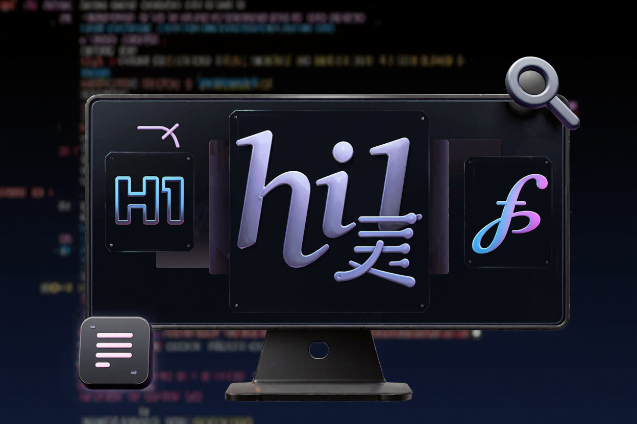
In the world of web design and content creation, typography is much more than just choosing a font. It's an art form that significantly impacts readability, user experience, and overall aesthetic appeal. Good typography guides the reader's eye, conveys emotion, and establishes a brand's personality. However, selecting the right fonts, especially when pairing them, can be a daunting task for many, even experienced developers and designers.
This is where font pairing tools become indispensable. These innovative resources simplify the complex process of combining different typefaces harmoniously. By leveraging algorithms and design principles, they help you discover pairings that work well together, saving you time and ensuring your designs look professional and cohesive. Let's explore how to effectively use these tools to elevate your typography.
Understanding the Basics of Font Pairing
Before diving into the tools, it's crucial to grasp the fundamental principles of font pairing. The goal is to create visual hierarchy and contrast without clashing. Typically, you'll want to pair a primary font (often for headings) with a secondary font (for body text).
Key considerations include:
- Contrast: Ensure there's a clear distinction between your chosen fonts in terms of style, weight, or size. A sans-serif heading paired with a serif body text is a classic example.
- Harmony: While contrast is important, the fonts should still feel like they belong together. Look for shared characteristics or a complementary aesthetic.
- Readability: The primary purpose of text is to be read. Always prioritize readability, especially for body copy.
- Mood and Tone: Fonts evoke emotions. Choose pairings that align with the message and brand identity of your project.
Why Font Pairing Tools Are a Game Changer
Manually testing countless font combinations can be incredibly time-consuming and often leads to frustration. Font pairing tools streamline this process by:
- Providing Expert Suggestions: Many tools are built on design best practices, offering combinations curated by typography experts.
- Visualizing Pairings Instantly: You can see how different fonts look together in real-time, often with sample text, making decision-making much easier.
- Filtering Options: Some tools allow you to filter by mood, style, or specific font families, narrowing down your choices efficiently.
- Learning Opportunity: They can help you develop an intuition for good typography by exposing you to successful pairings and the principles behind them.
How to Effectively Use Font Pairing Tools
1. Start with a Foundation Font
Begin by selecting one font that you love or that is central to your brand. This could be a display font for your logo or a clean sans-serif for your main headings. Many font pairing tools allow you to input your chosen font, and they will then suggest complementary options.
2. Define Your Project's Needs
Consider the context. Is it a professional website, a creative blog, or an application interface? The choice of fonts should reflect the project's purpose and target audience. For instance, a tech blog might lean towards modern, clean sans-serifs, while a personal portfolio might experiment with more expressive typefaces.
3. Explore Different Categories
Most tools categorize fonts (serif, sans-serif, script, display, monospace). Experiment with pairing fonts from different categories to achieve contrast. A common and effective strategy is to pair a serif font with a sans-serif font. For developers, tools often offer a wide range of options, making them a great addition to any free developer tools collection.
4. Pay Attention to Visual Hierarchy
A good font pairing creates a clear visual hierarchy. Headings should stand out from body text, and subheadings should be distinguishable from both. Use the tools to visualize how different weights, styles, and sizes of your chosen fonts create this hierarchy.
5. Test for Readability
Always test your chosen pairings with actual content. Look at them on different screen sizes and resolutions. What looks good in a tool's preview might not translate well to a full webpage or document. Ensure that the body text is easy to read for extended periods.
6. Consider Font Licensing and Availability
While exploring, keep an eye on font licensing. Many excellent fonts are free (Google Fonts, Font Squirrel), but some premium fonts require a license. Ensure your chosen fonts are available for web use and compatible with your project's technical requirements. This is an important step for any project, just like ensuring your images are optimized or using a PDF Compressor to reduce file sizes.
7. Iterate and Refine
Font pairing is rarely a one-shot process. Don't be afraid to experiment, try different combinations, and get feedback. Use the tools as a starting point, then fine-tune your choices based on your specific design needs. The best free developer tools empower this iterative process.
Popular Font Pairing Tools to Explore
Several excellent online resources can assist you:
- Fontjoy: Uses AI to generate font pairings based on contrast, similarity, or neutrality.
- Google Fonts Pairings: Offers curated pairings for fonts available on Google Fonts.
- Canva Font Combinations: Provides a wide range of pre-designed pairings for various moods and styles.
- Typewolf: A fantastic resource for inspiration and discovering what fonts top designers are using.
These tools, along with a comprehensive online dev tools collection, are invaluable for anyone looking to improve their typographic skills.
FAQ
What makes a good font pairing?
A good font pairing achieves a balance of contrast and harmony. It creates a clear visual hierarchy, improves readability, and effectively communicates the desired mood or tone of the content without making the design feel cluttered or inconsistent.
Should I use more than two fonts?
Generally, it's best to stick to two, or a maximum of three, different font families in a design to maintain cohesion and prevent visual chaos. More than three can make your design look unprofessional and difficult to read. If you need more variety, consider using different weights or styles within the same font family.
Can I pair two serif fonts or two sans-serif fonts?
Yes, it's possible to pair two fonts from the same category, but it requires careful consideration. Look for significant differences in weight, x-height, or character width to create sufficient contrast. The goal is to ensure they complement each other without being too similar or clashing outright.
Mastering font pairing is a journey that significantly enhances your design capabilities. By utilizing the power of font pairing tools, you can confidently create stunning, readable, and impactful typography for all your projects. Explore the options, experiment, and watch your designs transform.