
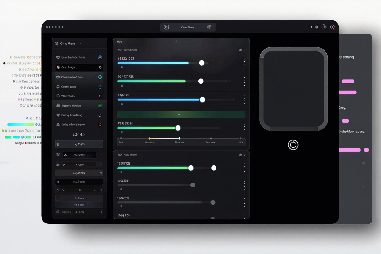
In the world of modern web design, subtle details often make the biggest impact. One such detail is the humble border-radius property in CSS, which allows you to round the corners of any element. While manually tweaking these values can be time-consuming, CSS border-radius generators offer a powerful, visual solution to achieve perfect curves with ease. These indispensable free developer tools streamline your workflow and elevate your site's aesthetic.
Understanding CSS Border-Radius
The CSS border-radius property is a shorthand for setting the four border-*-radius properties. It allows you to define the curvature of an element's corners, transforming sharp angles into smooth, rounded edges. You can apply a single value to round all four corners uniformly, or specify up to four values to control each corner individually (top-left, top-right, bottom-right, bottom-left).
Beyond simple rounding, border-radius also supports elliptical shapes, where you can define separate horizontal and vertical radii for each corner. This advanced capability opens up a world of creative possibilities, allowing for unique and organic designs that go far beyond basic circles or squares. Mastering this property is key to crafting sophisticated user interfaces.
Why Use a Border-Radius Generator?
While understanding the CSS syntax is important, manually adjusting values and refreshing your browser can be inefficient. This is where a dedicated generator becomes invaluable. It provides a visual interface, often with sliders or direct input fields, allowing you to see changes in real-time as you manipulate the corner radii. This immediate feedback loop saves countless hours of trial and error.
Generators also help prevent syntax errors and ensure cross-browser compatibility by providing clean, standardized CSS code. They are particularly useful for experimenting with complex elliptical shapes or creating intricate custom designs that would be difficult to visualize and code from scratch. For any web developer or designer, integrating such a tool into their workflow is a smart move.
Key Features to Look for in a Generator
When choosing a CSS border-radius generator, consider features that enhance usability and flexibility. A good generator should offer intuitive controls, such as sliders for incremental adjustments and direct input fields for precise values. The ability to control each corner independently is crucial for custom designs, allowing for asymmetrical or unique shapes.
A live preview pane is non-negotiable, showing exactly how your border-radius settings will appear before you copy the code. Look for options that support both single-value (circular) and dual-value (elliptical) radii. Finally, the generator should provide clean, ready-to-use CSS output that can be easily copied and pasted directly into your stylesheets, often including vendor prefixes for broader compatibility.
How to Effectively Use a Border-Radius Generator
1. Define Your Design Goal
Before you start sliding, have a clear vision of the shape you want to achieve. Are you aiming for subtly rounded buttons, circular avatars, or an entirely unique, flowing design? Knowing your objective will guide your experimentation and help you quickly arrive at the desired outcome.
2. Experiment with Individual Corners
Don't be afraid to break away from uniform rounding. Most generators allow you to adjust each of the four corners independently. This opens up possibilities for interesting asymmetrical designs, such as a card with a rounded top-left corner and a sharp bottom-right, adding visual interest and uniqueness to your elements.
3. Utilize Elliptical Radii for Creative Shapes
Many generators offer advanced controls for elliptical border-radii. Instead of just one value per corner, you can define two (horizontal and vertical). This is how you create more organic, pill-like shapes or even complex blob-like forms. Experiment with these dual values to push the boundaries of standard rounding and create truly distinctive UI components.
4. Leverage the Live Preview
The live preview is your best friend. As you adjust values, observe how the shape changes in real-time. This visual feedback is critical for fine-tuning your design, ensuring that the curves are exactly as you envision them. Use it to compare different settings and make iterative improvements.
5. Copy and Integrate the Clean Code
Once satisfied with your design, simply copy the generated CSS code. Most generators provide optimized, concise code, often with browser prefixes for wider compatibility. Paste this code directly into your stylesheet, and your element will instantly adopt the custom border-radius you've created. This seamless integration makes a border-radius generator an essential part of any online dev tools collection.
Beyond the Basics: Creative Applications
Border-radius generators aren't just for simple buttons. Think about applying unique curves to image galleries, testimonial blocks, or even entire sections of your layout. Combine them with CSS transforms or animations for dynamic effects. Consider using different border-radii on hover states to add subtle interactivity and polish to your components.
When designing for the web, it's also crucial to consider how all visual elements work together. Just as well-chosen fonts and colors impact user experience, so too do the shapes of your UI components. For instance, ensuring your images are optimized for web performance is another key aspect of a professional site; you can compare various formats using an Image Format Comparison tool to choose the best option for your project.
Integrating Generators into Your Development Workflow
Making a border-radius generator a regular part of your development process will significantly boost your efficiency. Instead of spending time on manual calculations or repetitive adjustments, you can quickly mock up and refine designs. This allows you to focus more on functionality and overall user experience, knowing that your UI aesthetics are handled with precision.
Many developers keep a curated list of their favorite free developer tools, and a robust border-radius generator should definitely be among them. It’s a small addition that yields big returns in terms of design quality and development speed.
FAQ
Q: Can I use different border-radius values for each corner?
A: Yes, the CSS border-radius property allows you to specify up to four values to control each corner independently (top-left, top-right, bottom-right, bottom-left).
Q: What is an elliptical border-radius?
A: An elliptical border-radius defines two values for each corner (horizontal and vertical radius) instead of just one. This allows for more complex, oval-like curves that can create unique shapes.
Q: Are border-radius generators compatible with all browsers?
A: Most modern border-radius generators provide standard CSS code, often including vendor prefixes (like -webkit- or -moz-) to ensure broad compatibility across different browsers, though full support can vary with very old browser versions.
CSS border-radius generators are powerful allies in crafting visually appealing and modern web interfaces. By leveraging their intuitive controls and real-time feedback, you can elevate your design quality and streamline your development process. Explore the possibilities and give your web elements the perfect curve they deserve today!