
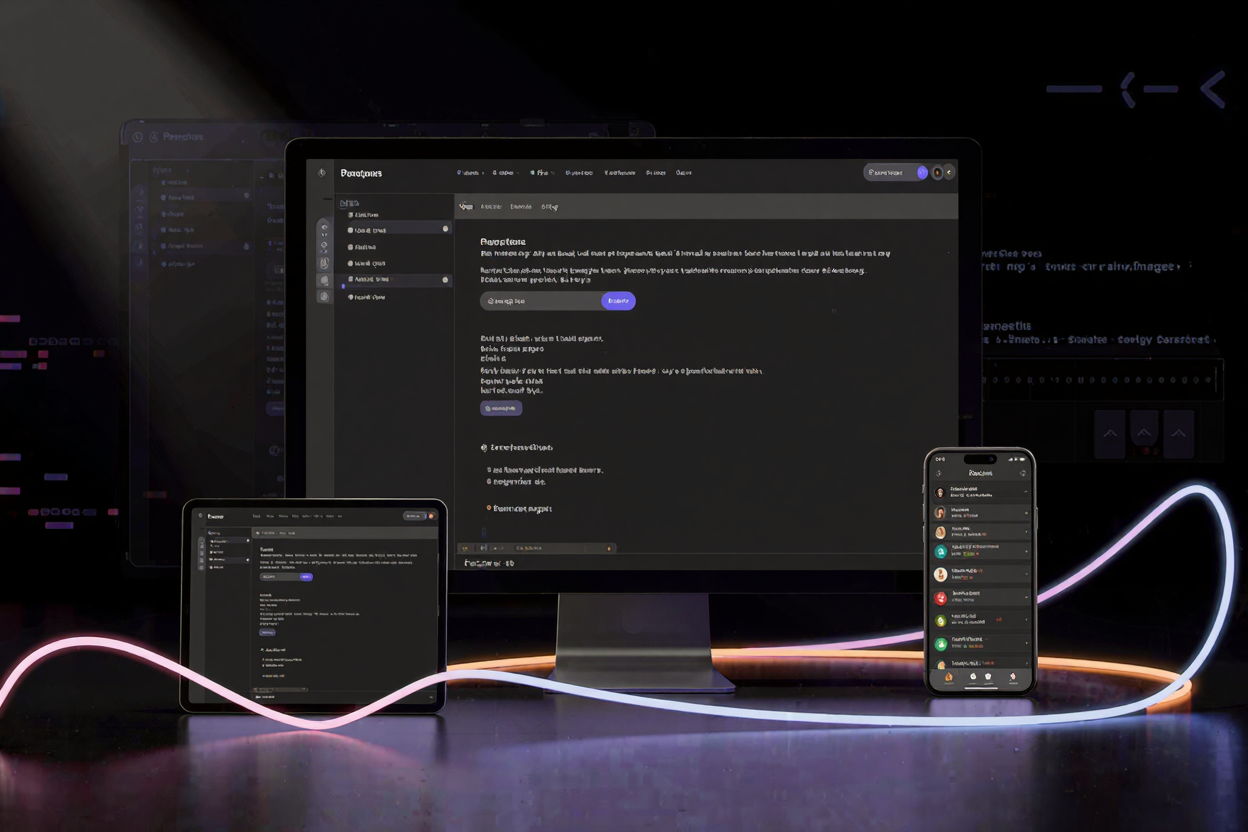
In today's multi-device world, a website's success hinges on its ability to adapt seamlessly to any screen size. Responsive design is no longer a luxury; it's a fundamental requirement for optimal user experience and search engine ranking. Ensuring your website looks and functions perfectly across desktops, tablets, and smartphones requires diligent testing, and that's where responsive design testing tools become indispensable.
These powerful utilities allow developers and designers to simulate various environments without needing a physical device for every permutation. By providing insights into how your layout, content, and interactive elements behave, they empower you to identify and rectify issues before they reach your users. Mastering these tools is crucial for delivering a consistent, high-quality experience.
Why Responsive Design Testing is Crucial
Responsive design testing isn't just about aesthetics; it's about functionality, accessibility, and performance. A broken layout or unclickable button on a mobile device can lead to immediate user frustration and abandonment. Poor mobile experiences also negatively impact your search engine optimization (SEO), as search engines prioritize mobile-friendly websites.
Thorough testing ensures that your carefully crafted content is always presented optimally, regardless of the user's device. It helps maintain brand consistency and prevents costly redesigns or patches down the line. Investing time in testing upfront saves significant effort and resources in the long run.
Understanding Responsive Design Testing Tools
The landscape of responsive design testing tools is diverse, offering options for every stage of development and budget. From built-in browser features to dedicated online platforms and advanced emulators, each category provides unique advantages for ensuring your website's adaptability.
Knowing which tool to use for a specific task can streamline your workflow and enhance the accuracy of your testing. Many of these tools are readily available, making comprehensive testing accessible to everyone. You'll find a wide array of free developer tools that can significantly aid your responsive testing efforts.
Browser Developer Tools: Your Built-In Lab
Modern web browsers like Chrome, Firefox, and Edge come equipped with robust developer tools that include powerful responsive testing features. These are often the first line of defense for developers due to their immediate accessibility and integration with the browsing environment. The Device Mode in Chrome DevTools, for instance, allows you to simulate various mobile devices and screen resolutions with ease.
You can adjust viewport dimensions, toggle between portrait and landscape orientations, and even simulate touch events and network conditions. These tools are fantastic for quick checks and debugging during the development phase. They provide a real-time view of how your CSS media queries and flexible layouts are responding to different screen sizes.
Online Responsive Testers: Quick Checks on the Web
For a quick overview or to share responsive views with clients, online responsive testing tools are incredibly useful. These web-based platforms allow you to input a URL and instantly view how it renders across a range of predefined devices or custom dimensions. They often display multiple device views side-by-side, making it easy to spot inconsistencies at a glance.
These tools are particularly helpful for non-developers or for getting a broad sense of your site's responsiveness without diving into code. They are an integral part of any comprehensive online dev tools collection for designers and developers alike. While not as detailed for debugging as browser tools, they offer a convenient, high-level perspective.
Emulators and Simulators: Deeper Insights
For more rigorous testing, especially for complex web applications or when needing to mimic specific operating system behaviors, emulators and simulators come into play. Android Studio and Xcode provide emulators for Android and iOS devices, respectively, allowing you to run your web application within a near-native environment. This is invaluable for testing interactions that might rely on specific device APIs or gestures.
These tools offer a higher degree of accuracy in simulating real-world conditions, including device performance and specific browser versions. While they require more setup, their fidelity to actual device behavior makes them essential for ensuring a polished, bug-free experience across critical platforms.
Mastering the Tools: A Step-by-Step Guide
Using responsive design testing tools effectively involves more than just resizing a window. It requires a systematic approach to identify and resolve layout and functionality issues. Start by defining the key breakpoints in your CSS, which are the points at which your design transitions to adapt to different screen sizes.
Access your browser's developer tools (usually F12 or Ctrl+Shift+I). In Device Mode, select various common device presets (e.g., iPhone, iPad, Desktop) and custom resolutions. Pay close attention to how your navigation, images, text, and interactive elements reflow and rearrange. Look for overlapping content, excessively small text, or elements that break out of their containers.
Beyond visual checks, interact with your site as a user would. Test forms, menus, pop-ups, and any JavaScript-driven features across different viewports. Simulate slow network conditions to see how your site loads on mobile. Remember that while responsive design tools are powerful, they are simulations. For critical user paths, performing checks on actual physical devices, even if just a few key ones, is highly recommended.
Beyond responsive testing, developers often manage various project assets, from code documentation to client reports. Ensuring these documents are easily shareable, perhaps by converting a detailed Word document to a universal PDF format using a tool like Word to PDF, is another aspect of efficient workflow.
Best Practices for Comprehensive Testing
To ensure your website is truly responsive, adopt a 'mobile-first' approach in your development and testing. This means designing and testing for the smallest screens first, then progressively enhancing for larger devices. This methodology often leads to more efficient and robust responsive designs.
Regularly test your website throughout the development cycle, not just at the end. Integrate responsive testing into your continuous integration/continuous deployment (CI/CD) pipelines where possible. Focus on testing key user journeys and critical components across your chosen range of devices and breakpoints. Leveraging a variety of free developer tools can significantly enhance the breadth and depth of your testing.
Document any issues found, along with the device and viewport size where they occurred. This helps in efficient debugging and ensures that fixes are applied comprehensively. Remember, the goal is a seamless experience for every user, regardless of how they access your site.
FAQ
What is responsive design testing?
Responsive design testing is the process of verifying that a website's layout, content, and functionality adapt correctly and provide an optimal user experience across various screen sizes and devices, such as desktops, tablets, and smartphones.
Which are the most common responsive design testing tools?
The most common tools include built-in browser developer tools (like Chrome DevTools' Device Mode), dedicated online responsive testers, and emulators/simulators provided by mobile development environments (e.g., Android Studio, Xcode).
Why is it important to test on actual devices?
While emulators and browser tools offer excellent simulations, actual device testing is crucial because it accounts for real-world factors like touch sensitivity, device performance, network latency, and specific browser quirks that simulations might not perfectly replicate. It provides the most accurate user experience validation.
Mastering responsive design testing tools is an essential skill for any modern web professional. By leveraging these powerful utilities, you can ensure your website delivers an impeccable user experience across every device. Start exploring the diverse range of available tools today to elevate your web development projects.